


INEE has a brand new look!
We are thrilled to share with you the new and improved INEE branding!!
After several months of discovery, discussion, and design work with our digital development partner, Taoti Creative, we are revealing, for the first time today, INEE’s new look.
What’s new?
Our logo is refreshed, our colors are expanded, and even our official font is new. You can already see one of the first implementations of our new branding in the template of this email. And this new branding will soon be rolled out in all of our templates, publications, and communications … including on our new website, which will launch in just a few days! You can find out all about our new branding in the INEE Brand Guidelines document.
What’s the same?
INEE is. We are the same network, with the same mission and the same functions. While we have adopted a fresh new look to match our ever relevant work, our focus and priority remains unchanged - to ensure the right to a quality, safe, and relevant education for all affected by emergencies.
Why the rebranding?
During the nearly two decades of the network’s existence, the INEE brand has become a symbol of who and what we are: welcoming, dynamic, trusted, rigorous, professional, and practical. More than ever, INEE exemplifies these attributes. Our brand is a promise to our members, partners, colleagues, and community, and we believe our new visual elements will help us convey the INEE brand better than ever.
Key branding notes (consult the INEE Brand Guidelines document for details):
-
 Name: INEE is officially called the Inter-agency Network for Education in Emergencies (INEE). In your use, please ensure the ‘a’ in “Inter-agency…” is lowercase, and please do not use “
InternationalNetwork…”. -
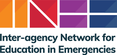
Logo: The vertical logo is the primary usage, with the full name under the logomark; see inset.
-
Colors: The four primary colors are orange, red, purple, and blue, with lighter shades of each as complementary colors.
-
Font: The primary typeface of INEE is Muli for English, French, Spanish, and Portuguese, and Markazi for Arabic; both are free Google fonts.
We hope you are inspired by our new visual identity (or, at least, that it will grow on you over time), and we invite you to help us replace our former logo and other elements with the new ones whenever you see them in use.
For questions about INEE branding guidelines and materials, please contact [email protected].